RedCLARA renews its visual identity aiming at a new stage of its trajectory
RedCLARA has a new look. The Latin American Cooperation of Advanced Networks launched its new visual identity, as part of the inauguration of its 20th anniversary celebrations, opening the doors to a new cycle in the history of the network, increasingly broader, modern and humane.
With the growth of its e-infrastructure, 11 National Research and Teaching Networks (NREN), including RNP, and more than 2,000 connected universities and research centers, multiple alliances signed and major projects promoted, such as BELLA and BELLA II, as well as the birth of the EU-LAC Digital Alliance and the expansion into the Caribbean, the time has come to broaden the horizon of understanding and use of the brand.
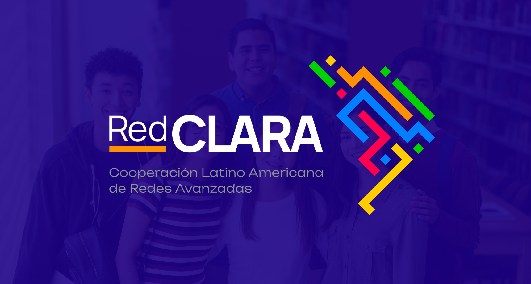
The new RedCLARA brand is accompanied by a revamped visual system that includes new colors and new institutional fonts. This system is based on three pillars: movement, which represents the constant exchange of information between universities and research centers around the world, the connection between the different territories and communities that make up Latin America and the Caribbean, and diversity, translated into a rich palette of colors that represent the plurality of peoples and cultures that make up the territory where the network operates.
“The change of our visual identity and all the work we are doing to reposition our brand is of great value, as it will allow us to express in a more forceful way the commitments that we have as an organization with all of Latin America and the Caribbean. The way the new logo is constructed, with the representation of the map, the interconnection of the lines that compose it and the beautiful colors, clearly show the identity of our region and the work that we want to develop", explains the Executive Director of RedCLARA, Luis Eliecer Cadenas.
In addition, there is a significant shift in brand discourse. From now on, RedCLARA's argument will prioritize the social benefits linked to the organization's activities, with a focus on improving the quality of life of people and communities. According to the Executive Director of RedCLARA, however, the change does not mean a break with history, but represents the natural evolution of a network that constantly seeks to update itself for the good of Latin America, the Caribbean and the world.
“We deepened partnerships, expanded the scope of our work and evolved in technology, connectivity and people. The new brand represents this evolution in a world that, especially after the pandemic, evolves at an incessant pace”, concludes Cadenas.
Watch the video of the new brand:
To learn about and download the new visual identity and the RedCLARA brand manual, access www.redclara.net
RNP also underwent a change in its brand in 2022. Remember here.