RNP's new brand: a new cycle deserves a new narrative and new symbolism

The National Education and Research Network has a new look!
A new moment, a new brand. And there is no shortage of reasons for this change to happen in 2022: 30 years of the first internet network in Brazil, the beginning of a new management contract signed by the organization and the celebration of RNP's 33rd anniversary this September. Therefore, for the first time since its creation in 1989, the institution underwent a rebranding process. The result was presented to the education, research and innovation community this Thursday (1st), at the closing of the RNP Forum.
The entire Executive Board gathered to show the new brand, which represents, at the same time, the pioneering spirit of RNP, responsible for bringing the internet to Brazil, and its role as an agent of evolution.
"It's not a break with history and values, but to reinforce and give new colors and shapes to something that is very present in us. And to continue programming and reprogramming this future. It's an opportunity for us to look at what we've done and manage this change, inaugurate new narratives", defined Nelson Simões, general director of RNP.
Immerse yourself with us in the creation process of the new RNP brand
As the video above highlights, RNP understood that it was time to look inside and better translate its essence.
“What does RNP promote for millions of Brazilians: connectivity or connection?”. This was one of the issues that guided our rebranding process. An in-depth survey with members of the academic community showed the perception that the National Education and Research Network offers connectivity through its entire network infrastructure. Connectivity is, however, the medium, the tool, the technology. It is through it that RNP generates connection, proximity, contact between people, ideas and institutions.
But what’s next? The future starts every day, and RNP is ready for the next revolution. The new brand comes to translate this evolution in a simple way, without leaving aside our 33 years of history.
Evolving does not mean breaking a story
After all, only those who are sure of what they are can evolve without losing their essence.
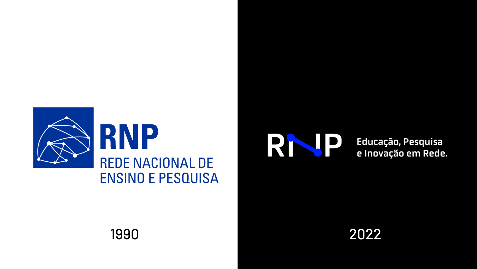
The creative process of the new brand took into account all the elements of the previous one – color, logo and symbol – and sought to re-signify and update them. Black comes in to indicate robustness and dialogues with blue, now more open, more 'tech'. Typography is cleaner and more contemporary. To symbolize the conceptual axis of connection, a simple and universal shape was included. This makes it clear that the idea is not to break, but to evolve.
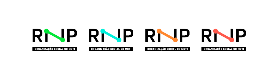
Just as the institutional blue became more open, other supporting colors will be used to facilitate the adaptation of the brand to new applications. Brighter and more digital-friendly colors were included to represent the dynamism we need today in so many media and channels.
RNP has a lot of appreciation for the brand that accompanied the organization's trajectory until today. It represents the first 33 years. If you don't know this story yet, check out the interview with the designer who created the first RNP brand.
Looking to the future: always!

The arrival of the new brand is an important step towards symbolizing what RNP does best: connecting, dialoguing, understanding, collaborating, co-creating and, of course, innovating. Find out more about RNP's new look by following this evolution on this website and on our social networks.